


goodstuff 009
designpeople
YOU KNOW THE TYPE
How would you measure the success of a type designer? Through widespread coverage, the success of their typefaces, or the subjective quality of their work? Seb Lester’s answers to these illustrious career criteria would be the use of his custom Intel typeface on all of Intel’s branding and product ranges and his development of typefaces used by Barclays Bank, Dell, The Daily Telegraph, GQ, The New York Times, The Sunday Times and the upscale supermarket Waitrose, for starters. Lester’s Neo Sans and Soho Gothic are amongst some of the best selling modern typefaces, holding their own amongst classics such as Helvetica and Futura.
The use of his type is not only huge but continually expanding.
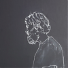
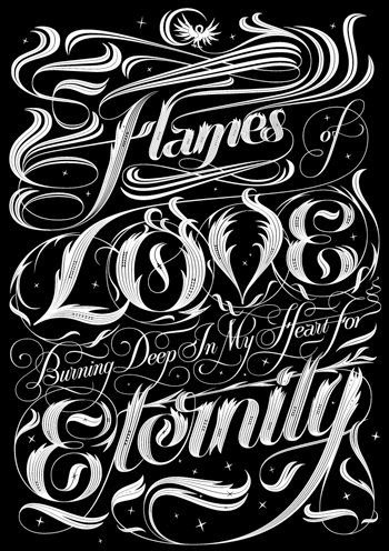
To vent some extra creative steam, he’s recently returned to personal typographic artwork and the results have again proved highly successful. Equipped with a singular typographic expertise, Lester’s process runs through trusted, thorough research and painstaking attention to detail and his work involves perfect calligraphic lines, creating unmatchable, classic longevity. The results have proved very popular throughout the spectrum, appealing to typographers, designers, illustrators and people simply after a damned fine tattoo.
—Johann Chan, 22 July 2009
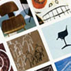
You can catch one of the UK’s finest type designers’ very first solo exhibition at the Electrik sheep gallery starting on the 6th August
SHARE: FACEBOOK TWITTER LINKEDIN STUMBLEUPON G+
HOME
contents